

Jun. 5 is “Logo Day”.
This day was set to appeal the effect of the logo designs, and was decided on this day from the sound, 6-5 (logo). Title logo is also a very important factor for the anime, since it is the first part that people see.
For example, “Argonavis from BanG Dream!”, the anime which is currently in the collaboration with Anime!Anime!, uses the logo where the word “ARGONAVIS” are highlighted from the back while being partly shadowed. It implicates being on stage with intense light and imagines the boy’s band getting popular.
There are many appealing logo designs. Which logo catches the heart of the Anime!Anime! readers the most?
We conducted the reader’s survey titled, “Which title logo design of the anime do you like the most?”. The survey was conducted from May 25 to Jun. 1, and a total of 194 people answered the survey.
The female readers made up the majority with approximately 65%, while the male readers made up approximately 35%. For age group, the young readers made up the majority, 19 years old or younger readers made up approximately 60%, while 20’s made up approximately 20%.
■The logo with condensed world view of the anime gained popularity
In this survey, the titles which stand the test of time gained many votes.
For “Space Battleship Yamato”, the readers mentioned the letters of “Yamato” strongly written leave a great impression in them by saying, “I can feel the passion from the three handwritten letters “Yamato” and “The unique analog font of the logo. I feel excited as if the space adventur wille begins when I look at that logo”.
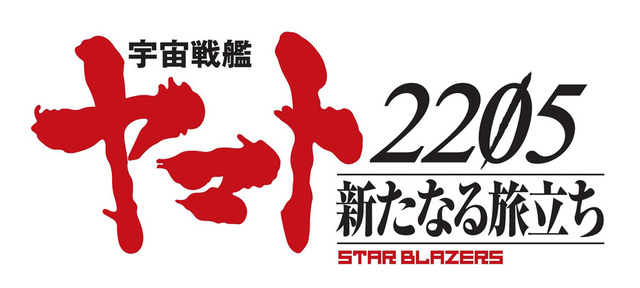
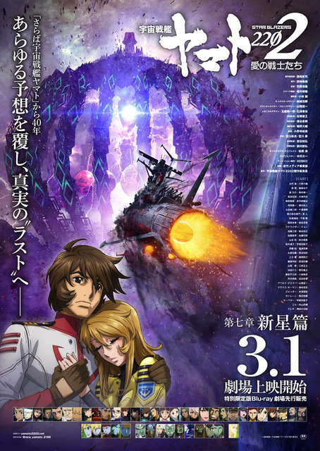
Also for the latest movie “Star Blazers: Space Battleship Yamato 2202”, the logo which emphasized last “2” of the logo gained popularity, and the comment related to it said, “I love ‘Yamato’ logos from the past works, but I also love ‘2202’ logo because it implicates the meaning hidden in the numbers and that’s cool”.
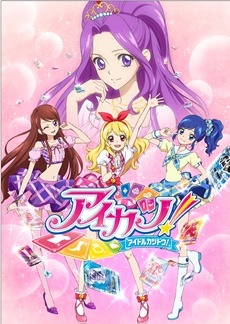
The logo from the 1st “Aikatsu” series were popular. The logo gained its popularity for being simple and catchy, and the comments said, “The logo does not have any unnecessary design, and it also contains the card design. I feel like this is ‘Aikatsu'”, and “the exclamation mark is large and works as an appealing point”.
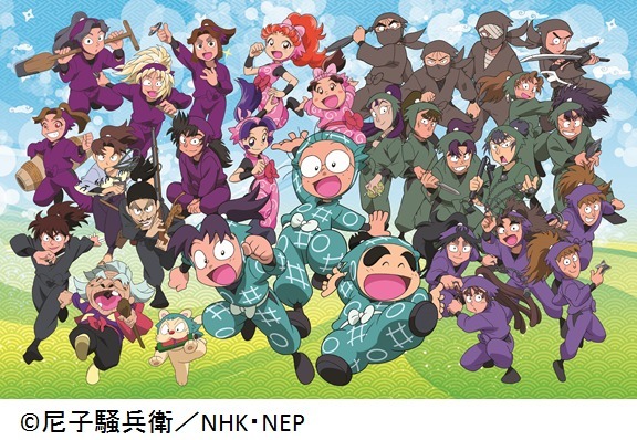
A comment for “Nintama Rantaro” said, “I think the logo expresses the anime well when it has the word Nintama in the eggs and contains the illustration of Shuriken since they are ninjas”. This showed the logo with items from the anime gains wide popularity.
■It moves! It changes throughout the series! The performances unique to anime series were popular
For the anime with original works, it is possible to arrange originally for the anime and as the series, while keeping the design of logo from the original work.
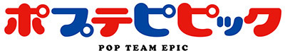
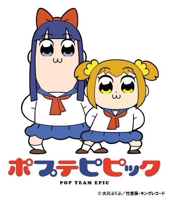
For example, many animation logo were created when producing the anime “Pop Team Epic”. They left a great impact on the fans, and comments said, “Round letters are very impressive. ‘Low quality’ can be felt easily from the font. lol”, and “the voice of reading the title matches nicely with the round font of the logo”.
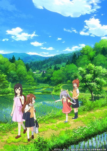
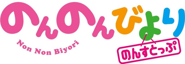
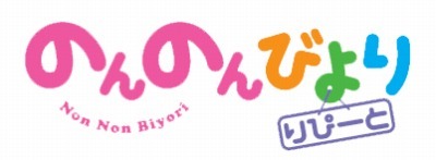
“Non Non Biyori” uses logo in the middle and at the end of the episodes. The comments said, “Round, cute font expresses slow life at the rural area, while colorful design expresses the energetic children in the anime”, and “I love how the logos move as an eye-catch”.
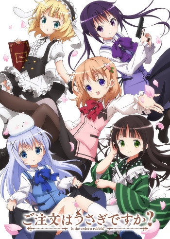
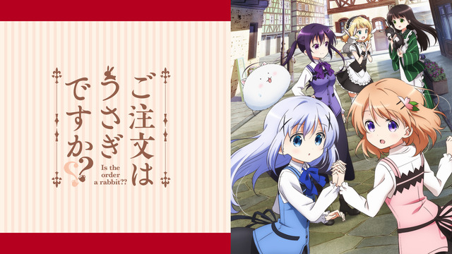
The comment to “Is Order a Rabbit?” said “The design around the font is beautiful. I also like how two question marks are combined into a heart in the second season”.
For “Gintama”, the comment said, “I felt the possibility from the logo when the slash of the final arc called ‘Spirit of Gin” can be read as “no” (a postpositional particle in Japanese language)”.
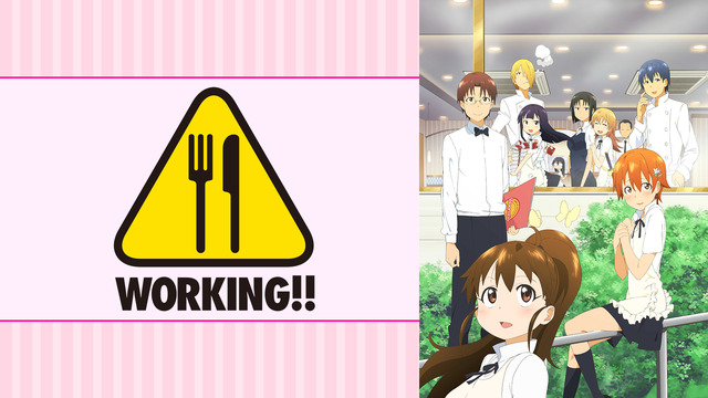
For “WORKING!!”, the comment mentioned the uniqueness due to having its stage at the family restaurant: “There is an exclamation mark in a triangle right above the title logo, like a warning sign, and I was surprised at how that exclamation mark was made of a knife and a spoon”.
■Introducing other comments!
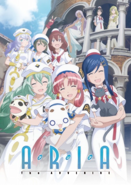
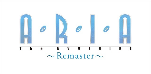
For “ARIA” series: “The coloring used is inspired by water, since the planet of water is their stage. There are the surface of water inside the letter, and this is one of my favorite anime logos.”
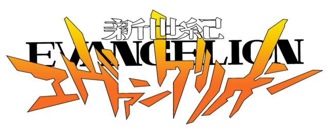
For “Neon Genesis Evangelion”: “A stylish ‘Neon Genesis’ and intense ‘Evangelion’ matches well!”
For “Idolish Seven”: “I love how each letter is in the member color in the opening theme of the 2nd season”.
There are many fans who remembered the logo together with the opening theme song.
This result made the variety of logos even more interesting.
■Titles with many votes (no particular order) [Which title logo of the anime do you like the most?]
“BLEACH”
“Free!”
“Aikatsu!”
“Idolish Seven”
“Osomatsu-san”
“Is Order a Rabbit?”
“Love Live!”
“One Piece”
“Space Battleship Yamato”
“Demon Slayer: Kimetsu no Yaiba”
“Gintama”
“Yuki Yuna is a Hero”
“Kuroko’s Basketball”
“Yowamushi Pedal”
“Neon Genesis Evangelion”
“Attack on Titan”
“Sekai Ichi Hatsukoi – World’s Greatest First Love”
“Rascal Does Not Dream of Bunny Girl Senpai”
“My Hero Academia”
“Detective Conan”
(Survey conducted: May 25, 2020 to Jun. 1)